 Blog
BlogHow to draw beautiful software architecture diagrams (part 1)
September 23, 2022
|by Jordan
Have you ever been in a meeting where a diagram is drawn, and when it ends, no one wants to erase the whiteboard? Instead, someone takes a picture of it on their phone, or they'll roll the whiteboard out to your team area and draw a big "DO NOT ERASE" sign. Over the next month, discussions gravitate around this diagram. People randomly walk up and stare at it. Questions are answered by pointing at it. Periodically throughout the day, chairs swivel around to face this centerpiece, their occupants folding their hands behind their heads.
What defines a diagram like that? The content, of course, has to be correct: things have to exist at the right abstraction levels, it's up-to-date, there's no ambiguity, etc. But there are many ways to draw the same dozen entities and relationships. Some of those have staying power that clarify and spark collaboration for the entirety of a project, while others don't live past the end of the afternoon meeting.
Below are some properties of beautiful diagrams. I don't mean beautiful in the designer sense of drop shadows and rounded corners, but rather, functional beauty that maximizes its effectiveness to communicate ideas.
Minimize neighbor distance
This is simple to get right for small diagrams, but much harder to do as they grow larger. If you just have two nodes connected to each other, obviously you draw them close to each other. But what if your diagram currently looks like this...
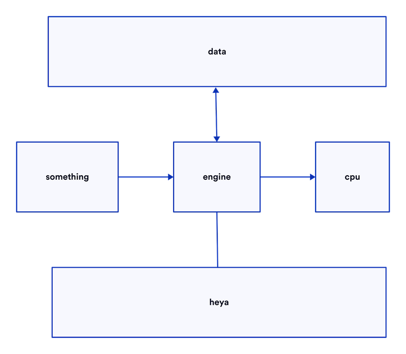
... and your next move is to draw that "engine" connects to more things. That's when this property starts eroding away.
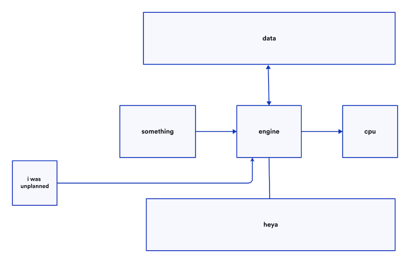
Instead, if you had planned ahead, or taken the time to redraw, you could've maintained the low distance between nodes.
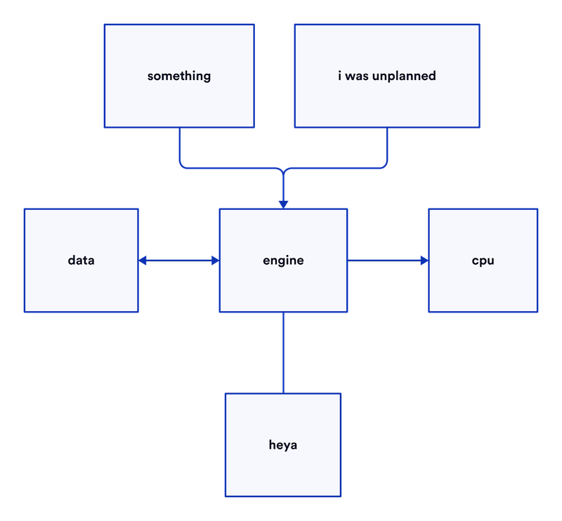
If you were coding and realized a function you just wrote wasn't accounting for an edge case, you'd probably rewrite the relevant areas to account for it. Or in your written docs, if you realized you were missing an item in a list, you wouldn't write, "Oh and also this", you'd just go back and amend the original sentence! But when it comes to diagrams, it's an order of magnitude more time-consuming to erase and redraw than it is to backspace and retype. It's not worth the trouble in an interview context, but if you're drawing something for documentation-sake for multiple people -- maybe even multiple teams -- then the constant redraws will result in much more beautiful diagrams.
Find symmetry
Symmetry in diagrams is a big contributor to a pleasing perception of aesthetics. Our brains are subconsciously wired to favor visual symmetry (e.g. faces). Further, it helps us quickly make sense of diagrams.
In this example, all the nodes are maximally close to their neighbors.
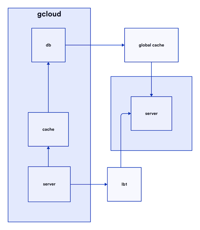
But it looks a little off, like a slightly askew painting. It's the lack of symmetry that stands out to us.
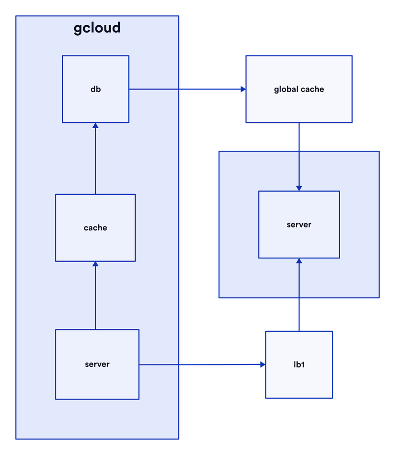
This version looks more pleasing, even though "lb1" (bottom right) has increased in distance from its neighbors, and "cache" (middle left) identical distance to its neighbors as before.
Keeping things symmetrical can also enhance the meaning a diagram carries, like having all the inputs on one side, and all the outputs on the other.
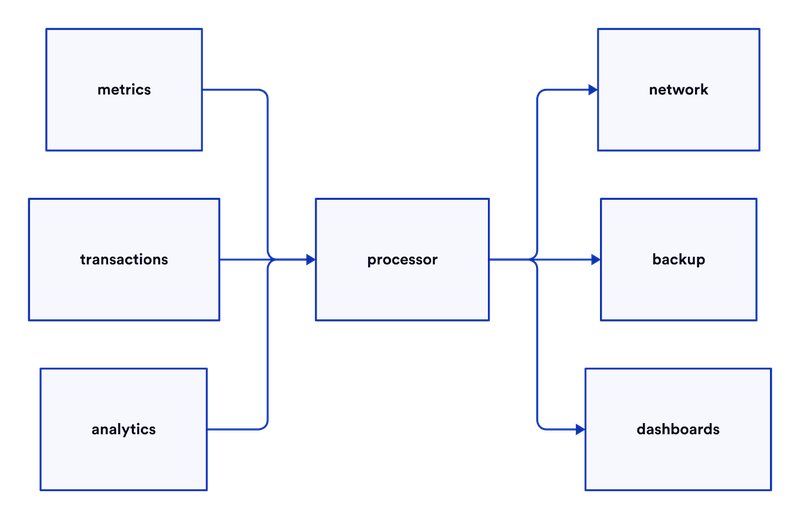
Align centers
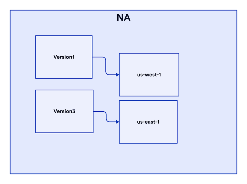
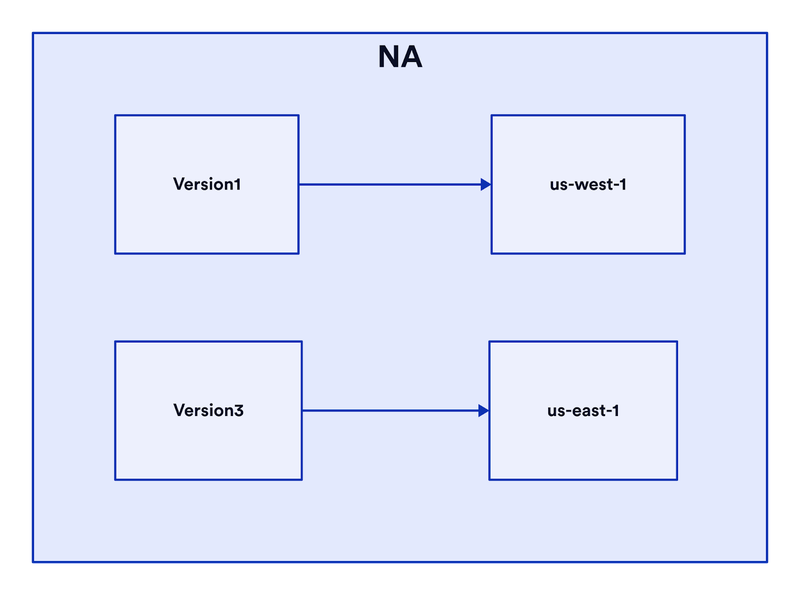
Alignment is the biggest contributor to diagrams looking neat, which you should care about because neat diagrams make concepts clearer, while messy diagrams make concepts more complex. A series of simple diagrams can make even the most complex systems understandable.
It may not seem important how neat and aligned your handful of shapes are when you begin drawing a diagram, but nobody has ever thrown 50% of their clothes on the floor and folded the other 50%, or kept half their room neat or bed made. Starting off plopping shapes randomly on a blank canvas puts you on a road to random placements for the rest of the diagram. Alignment only has meaning between two or more shapes (i.e. something can't be aligned to itself). By maintaining the property for each new addition, you'll find your diagram looks neat ~effortlessly.
This property often comes from being symmetrical, but not always.
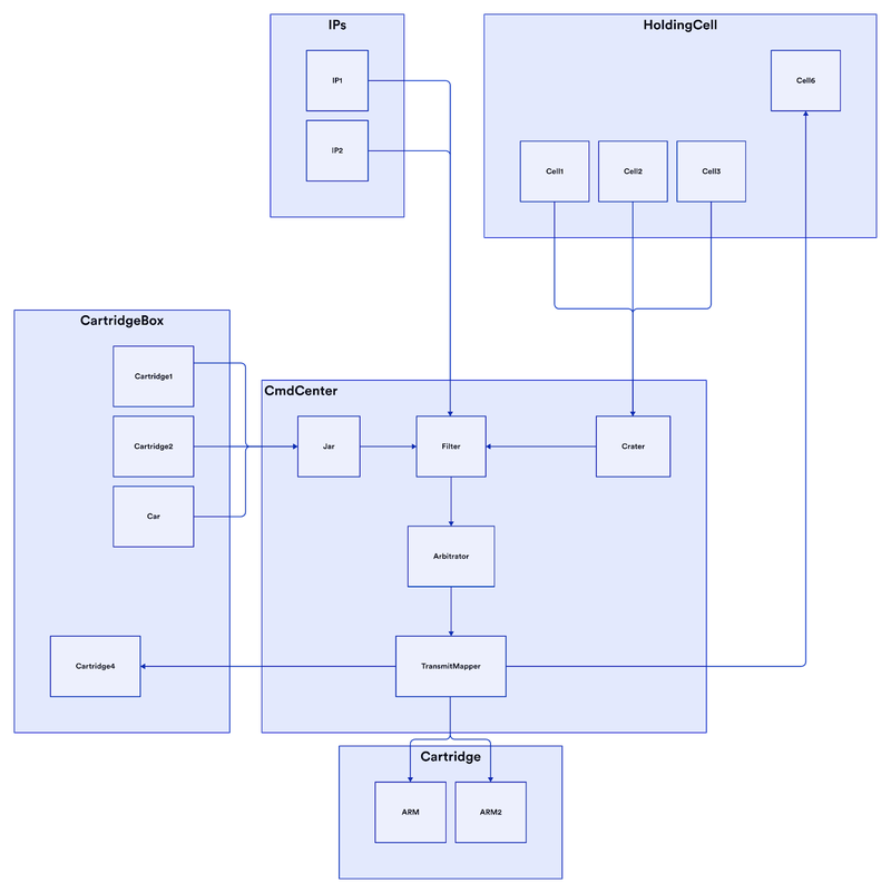
Use container groups
Distinguishing your diagram into multiple, labeled regions makes it much more understandable for viewers. Containers can
- add context ("these services are in AWS and these are in Azure")
- show abstractions ("these are all implementations of ReaderWriter")
- group related objects (cores 1, 2, 3, 4 in a "Cores" container)
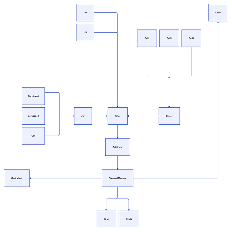
Notice how adding containers makes the diagram much clearer
To be continued
In part 2, we'll cover
- Drawing edge routes
- Label sizes and positions
- Colors
- Icons


 Previous post
